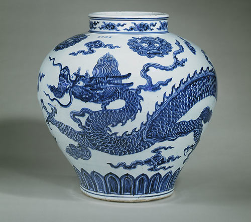
H. 19 in. (48.3 cm)Gift of Robert E. Tod, 1937 (37.191.1) On view: Gallery 204
Although, this image does not clearly show the Xuande mark and period on the jar, it is widely accepted that these particular markings came from “the famous calligrapher Shendu, since the official mark of Xuande is following his hand writing.”
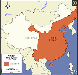
The Ming Dynasty (1368-1644) restored its Chinese reign and reinstated traditional Chinese art after reclaiming control from a century of being ruled by the Mongols between (1279-1368).
I selected the above jar for its shape and color; the cobalt blue on the white porcelain background is the ideal setting for focusing on the fine intricate lines of the dragon. The following quote sums up the image on the jar, “his dorsal fins are like the teeth of a buzz saw, his claws have a strong bone structure, and he moves around the jar with total power yet consummate grace.”
Dragons are an important symbol of China, contrary to the western folklore who tend to see dragons as fearsome and destructive creatures. In China the dragon is associated with the Emperor’s emblem and the people believe the Dragon is friendly and helpful, it is associated with power, wisdom, strength, goodness, gives blessings and protection, wards off evil spirits, and brings good luck and rain. There seems to be countless meanings for its beloved symbolism in the Chinese culture. For the sake of a shorter blog I have selected the above explanation.
Most Eastern dragons are shown with three to four toes or claws. Only the emperor’s objects or attire had five toed dragons, shown as a symbol of power.
Dragon Jar China Date: AD 1426-35 (Ming dynasty)
Who do you think possessed this Jar?
Ok, start counting… this little Dragon went to the market; this little Dragon stayed home; don’t stop counting I know you know this rhyme… 🙂
“So this beautiful vase was made for the emperor in the Imperial workshops. The fierce yellow dragon rushes through the clouds chasing a flaming pearl. His long body winds the whole way around the jar.”
To learn more about this time period and other Dynasties click on the following clip.
People in Chinese think that Chinese dragons are lucky creatures which can bring happiness and power, and even worshiped as gods.
Western dragons are portrayed as evil because they would eat people or destroy villages. So there is much folklore about the fighting between heroes and dragons. But there are still some exceptions. Some of them are wise and would help people when they need advice.
2. Dragons’ legs
Chinese dragons all have four legs.
Some Western Chinese have two legs, but some of them have four legs.
3. Dragons’ wings
Most Chinese dragons don’t have wings.
Western dragons usually have bat-like or bird-like wings.
4. Dragons’ skin
Chinese dragons have scales.
Some western dragons have leather skin, not scales.
5. Dragons and festivals
Chinese dragons often appear in Chinese festivals, celebration and weddings.
As we know, western dragons seldom appear in festivals.
6. Similarity and differences with other dragons which are the same species.
Most Chinese dragons look similar though they have different colors and small parts of body features.
Western dragons look very different from other western dragons. Some look like snakes, when others look like dinosaurs, and even lions.
Past assignments have included known artists, their works and time period. I selected this subject matter because the Nazca Lines in southern Peru continue to remain a mystery and continue to puzzle both laymen and scholars alike for nearly a hundred years since their existence was made known outside of Peru.
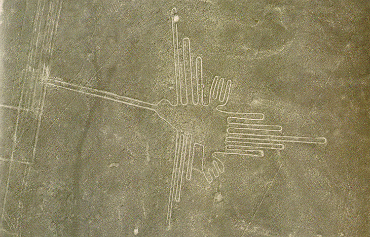
Presently, no one person can confirm the artists, the exact time period nor the meaning of the Geoglyphs and Biomorphs; such as the Hummingbird image.
Earth Drawing, southwest of Peru 200 B.C.E. – 200 C.E. Nazca Desert
Hummingbird length 450′ and wingspan 200′
The Nazca Desert is one of the driest deserts in the world and it is located on a plateau about sixty miles long and five miles wide near the coast of Peru. Lima one of the nearest cities is approximately located 250 miles away. Located inside the desert are ancient lines, geoglyphs, trapezoids and biomorphs such as a whale, monkey, and a giant man who appears to be an astronaut.
Antiquity works from an ancient civilization that seemed to have ended abruptly leaving no written history. What is the meaning of these lines and images? Were they created for spiritual or astronomical reasons? Were they created for meditation purposes like Labyrinths or for mythical creatures?
Were they used as a guiding map or in connection with man and the creatures that surrounded the ancient people? Were they created for agriculture practices? Some have even theorize they were made for Extraterrestrials. What is the purpose of their existence or message? There are many theories with unanswered questions, which make them all the more intriguing. In addition, scholars cannot seem to agree on the exact time period or periods they were created.
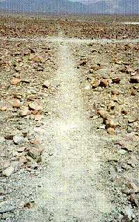
Nazca Line
Created by removing the rock debris (iron oxide pebbles) and exposing the white soil underground. (Photo courtesy of Michael J. Way. Copyright Michael J. Way)
Three key individuals seem to surface frequently in my research on the Nazca Lines.
In the 1920s’ Peruvian archaeologist Toribio Mejía Xesspe came across the lines and later gave a presentation about them in the 1930’s.
Paul Kosak (1896-1959) an American Professor of History and Government was the first scholar to study the Nazca lines from the academia point. His field of study was on form’s of irrigation in ancient cultures; including studying the culture in Peru,1940-1941 and 1948-1949.
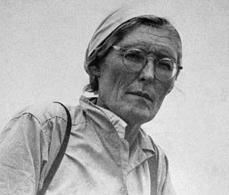
Maria Reiche (1903-1998) born in Germany and attended Dreden Technical University. She spoke 5 languages, and was a mathematician. In the 1930’s she traveled to Peru to work as an Nanny, about the 1940’s she became an assistant to Paul Kosak who arrived in Peru to study agriculture and irrigation. Paul Kosak became a mentor to Maria Reiche. After Kosak returned to America, Reiche remained in Peru and devoted her life to studying and preserving the Nazca Lines. With sales from a book she wrote, she hired assistants and guards to monitor and help protect the Naztec Lines. In 1994 she became a Peruvian citizen she passed on in 1998 at the age of 95 at an Airforce hospital in Lima. Maria Rieche was buried with honors near Nazca, her home is now a museum.
Endearing name “Lady of theLines”
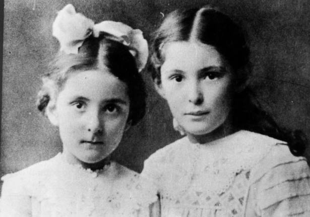
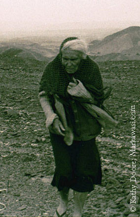
Sisters, Renate on the left and Maria Reiche on the right both photo credits unknown
I selected the following photo because of Maria’s physical appearance and in her choice of clothing. I believe the photo shows Maria’s immense devotion to Peru and the Nazca Lines.
Optional click photo to enlarge.
Note: Her sweater’s sleeves are tattered and long, overlapping her hands, she keeps a shawl clutched tightly to ward off the elements of the desert weather, the background shows the desert terrain with its peaks and valleys an arduous journey for anyone, she is shown walking away from the terrain on a plain, her face is weathered from years of being in the sun, creased like the lines of Nazca, her hands spotted and weathered like the rocks on Nazca’s desert floor, her stooped walk shows her age, and her silver hair shines white like the Nazca Lines, strands of her hair and the fringes of her shawl are windswept towards the right of the photograph, she is wearing sandals and a dress her feminine side, “Lady of the Lines”, she has something in her pocket on the right side it is slightly pouched. What is in her pocket? A mystery item we will never know. We can theorize is it a tool or a rock she collected on her walk? It seems as if Maria Reiche has merged into one with her beloved Nazca Lines, aged into Peru’s ancient history.
Music for stress relief, tranquility, and rejuvenation. Beautiful crisp images with rain and nature sounds, (ahhh… so relaxing) be sure to listen to the Andean Pan Pipe music which begins at 1:40 minute/seconds into the video.
What does Barack Obama and Andre the Giant have in common
with Post Modern Art?
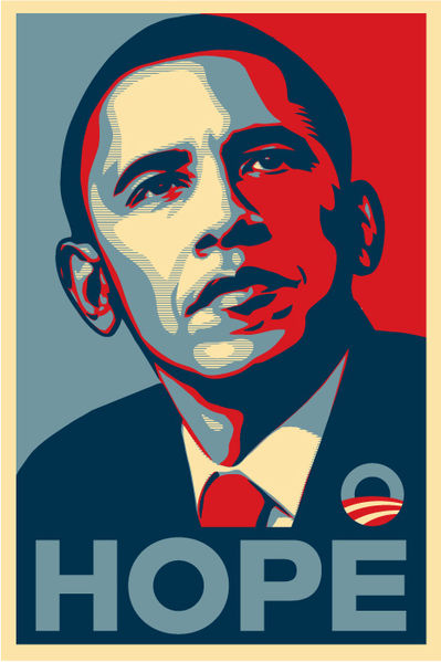
HOPE,2008
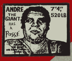
Andre the Giant Has a Posse, 1989
Both are works by Shepard Fairey (American, born 1970)
Introducing Street Artist Frank Shepard Fairey.
Frank Shepard Fairey was raised in Charleston, South Carolina he is a contemporary graphic designer and illustrator. He entered art school when he recognized he was not going to make it into the Professional Skateboard circle. Skateboarding was his world; he knew its underground culture well. He used his artistic talent then, and even help fill a void in skateboard art for fellow skateboarders by designing T-shirts and stickers for them.
After he realized he would never become a Pro Skateboarder and perform for the mass media and spectators; he decided to attend college. In 1992 he received a Bachelor’s degree of Fine Arts in Illustration. With time his natural talent in the arts propelled him into the mass media at the public level captivating the attention of many who became followers of his art.
His arrival as a Professional artist instead of a Professional Skateboarder came in several parts through his artistic talent, President Obama’s campaign and luck by way of a joke. I will discuss more about the joke that propelled him into Pop art later in the blog.
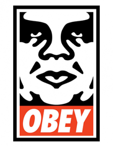
He created art that caught the public’s interest, the culture and current movements and adopted this into his work. Such as, Andre the Giant Has a Posse (a French professional wrestler and actor who suffered from Gigantism.) Fairey recaptured Andre’s wrestling image from the past and modernized it into a form of Dadaism art.
Fairey’s original intent for his Andre the Giant Has a Posse was to make it an underground skater’s inside joke. His remake showed the differences between wrestling as a sport and what the skateboarders, punkers and hip hop culture was like. Here is Fairy’s explanation of the inside joke. “So this obey giant Posse thing was like the inside joke, skate crew thing, making fun of what it’s condemning, making fun of having a crew, but being one, making fun of the language. Wrestling was the most uncool thing to uberhip skaters, but to associate yourself with it was funny, it was a paradox.”
After the Andre the Giant Has a Posse went viral “Fairey discovered a secret that has been closely guarded by every religious, political and mercantile authority from the Catholic Church to Coca Cola: mind control is easy and fun, not to mention profitable.”
Shepard Fairey, “OBEY” Street Artist and Designer. February 22, 2009
Andre The Giant “Obey Giant”
Frank Shepard Fairey “Obey Giant” 1992
Fairey has learned how to transcend his art and messages between street, commercial and fine art. He says he has found the balance between the creepy, goofy, sinister and likable that touches people’s emotions. For example, some who view Fairey’s “Obey Giant” may sense eeriness about it with its ominous stare, on the flip-side another person may view it as an imaginative silly or likable image.
The original Andre the Giant has a Posse 1989 morphed into the more generic form used today. After the WWF (World Wrestling Federation) and some of WWF fans pressured Fairey to make a change in his illustration of their beloved wrestler.
This change sparked yet another round of thought provoking reaction. Fairey, made some changes to his original illustration and he removed the title Andre the Giant has a Posse and replaced it with the word “Obey.”
When people encountered this new poster or sticker with the word “Obey” some wondered if it came with religious intentions or to control behavior, others felt they were being watched. How does it make you feel? What would you think or feel if you came across this sign posted in a public setting?
Shepard Fairey of Obey | Skateboarding, Graffiti, & Andre The Giant
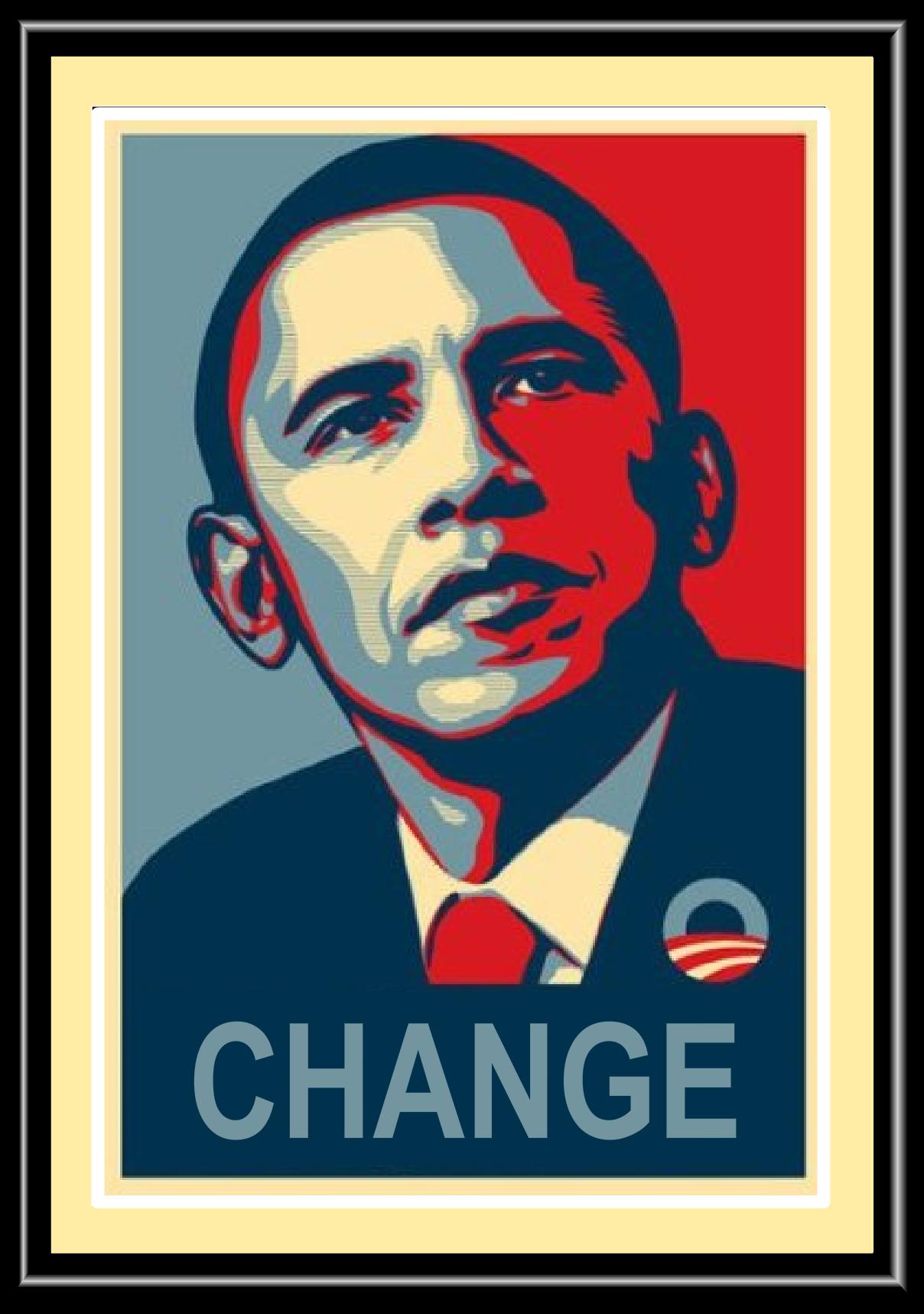
In 2008, Fairey created the now widely recognized
Hope poster of Barack Obama.
Shepard Fairey (American, born 1970) ‘Change’ Poster 2008.
The above image of Barack Obama is shown after Fairey added his own illustrated style into an original 2006 photo by freelancer Mannie Garcia taken for The Associated Press. In fact, Fairy Googled a photograph to use to make his now famous campaign poster. Fairey not only recreated a digital image he added several one-word themes of the same image to invoke a message. For example, if you scroll back to the top you will notice the first Barack Obama image has the word “HOPE” and this one shows “CHANGE” the third not shown is “PROGRESS.”
Obama Campaign Poster
Fairey and The Associated Press (AP) became embroiled in a lawsuit over the AP image. He received a fine, probation and community service hours for his actions.
Many postmodern artists feel that it is ok to borrow, adopt, recycle, steal, or sample from other’s works. Do you believe he received a just sentence or do you believe he had not done anything wrong?
WHAT DOES ANDY WARHOL HAVE IN COMMON WITH DUSTHEADS?
Introducing Graffiti Street Artist Jean Michel Basquiat
“I don’t listen to what art critics say. I don’t know anybody who needs a critic to find out what art is.”
― Jean-Michel Basquiat
His ethnic identity, artistic talents and knowledge of African culture and history transcended his African works into an unusual gift of emotional depth for the observer. Other two known artists who adapted works from Africa were Pablo Picasso and Henri Matisse decades earlier.
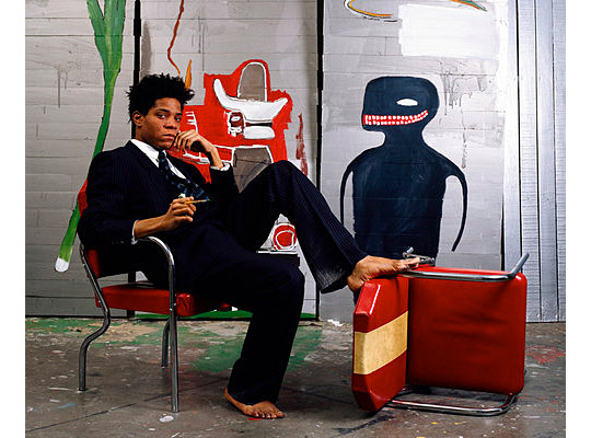
Jean-Michel Basquiat was born in 1960 and raised in Brooklyn. As a young child (age six) Jean Michel’s mother saw that her son had artistic talent and enrolled him as a member of the Brooklyn Museum to cultivate his emerging talent. By the time he was twenty, his artistic works made it to the SoHo Galleries. Collectors began to purchase his art for its originality, and for his use of color, composition and emotional depth. Both Frank Sheppard Fairey and Basquit used language ”words” in their works to emphasis a theme.
I highly recommend viewing this brochure on TIMELINE (Basquiat).
By 1985, Basquiat’s popularity continued to grow and he was featured on the cover of The New York Times Magazine as the next upcoming artist on the art market.
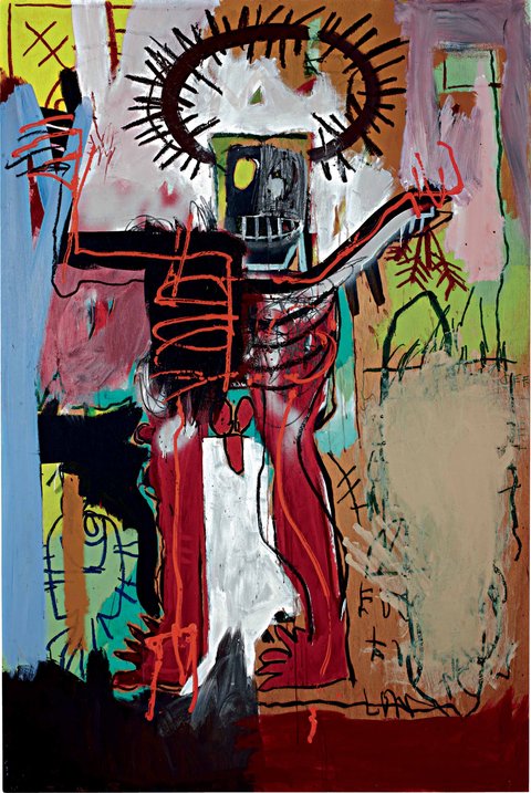
Untitled 1981 painting by Jean-Michel Basquiat
Sold for 16.3 million, on May 10, 2012
This piece is unnamed, my personal interpretation of the painting is it must be Basquiat’s version of Christ being crucified on the cross. Note, thehalo appears to be a crown of thorns (many of his works depicted with halos represented important figures) on the upper left corner is a crucifix and in the left bottom corner is a fish and it may refer to Mathew 4:19 from the Bible.
What is your interpretation? Do you agree or disagree with mine? Does it seem plausible?
An absolute must see! Basquiat Official Trailer #1 – (1996) HD
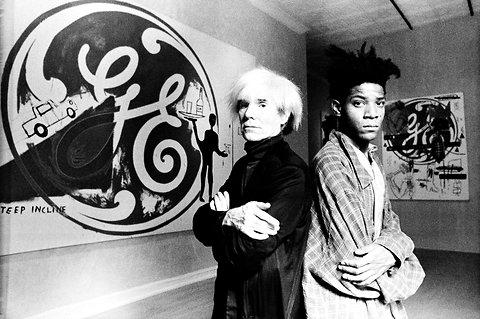
Andy Warhol and Jean-Michel Basquit were friends and had collaborated on several works together.
Richard Drew/Associated Press Andy Warhol and Jean-Michel Basquiat at the Tony Shafrazi Gallery in New York , September 1985.
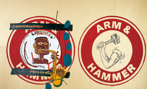
Arm and Hammer II, (Acrylic on Canvas, 76 x 112 inches, 1985)
Shown here is a painting by both Andy Warhol and Jean-Michel Basquiat
Basquiat’s was widely known for painting brushstrokes by using words. Note, Basquiat’s word “Liberty” above the African musician and the year “1955,” during this era there was a struggle for basic civil rights. Some believe the working man’s arm and hammer depicts black labor.
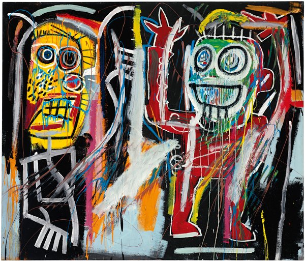
“DUSTHEADS” by Jean-Michel BasquiatSOLD FOR$48,843.750
72 x 84 in. (182.8 x 213.3 cm.) Painted in 1982. RECENT SALEMAY 2013
“Dustheads” street slang for users of PCP or Angel Dust. One figure is shown confused and the other is portrayed as in a daze.
Watch how fast $48,843.750 is spent in an auction.
Thereis some serious bobble head movement happening in the audience as the auctioneer and bidders go toe to toe for the first world’s record selling sale of an artist’s works sold to an unnamed client on the phone.
Did some Avante- Garde European artists and The School of Paris view African Art for inspiration? During that time period many African pieces were in pawn shops, private ownership and shown in galleries as curiosities. I say, unquestionably, there is some symbolic relation between Early Modern art and Africa. For example, I believe artists Henri Mattise and Pablo Picasso were influenced by African objects during this time period when thousands of items were being introduced to Europe, filtered through France and other regions of the world by way of Colonial Power and their establishment in Africa. Although, World War I began in 1914 the influence of African art was already circulating through parts of Europe and later the U.S.
Map of Africa
Note: Shaded area under Colonial Power
FAUVISM began in 1905 after an exhibit held at the Autumn Salon in Paris. The artists’ random use of colors and style was to astound the observer both visually and mentally.
Mattisse was the leader of the fauves and in reading I learned he was also a collector of African art. Could it be possible that some of his works of arts may have been inspirations drawn from African art. Albeit, both Mattisse (Fauvsim) and Picasso (Cubism) denied any influence of African art for inspiration in some of their works.
How did African works arrive to be in exhibits? During the 19th century the Colonial powers and their presence in Africa was detrimental to the African culture. Adversely impacting the early modern art movement. How exactly did this occur? Many African traditional and ceremonial works from various ethnic groups of Africa, such as the Fang tribe under Colonial Control were collected, or forcibly took and then exploited.
In the 19th Century (January 1, 1801 – December 31, 1900) and the 20th Century (January 1, 1901 and December 31, 2000) countless African objects arrived in Europe and filtered through France. This is the within the time frame, historically where artists such as Matisse and Picasso saw African exotic carvings and mask like pieces. Like many artists who are introduced to a new style or medium they sometimes try to emulate that style into some of their own works of art.
What do you think… compare the following works.
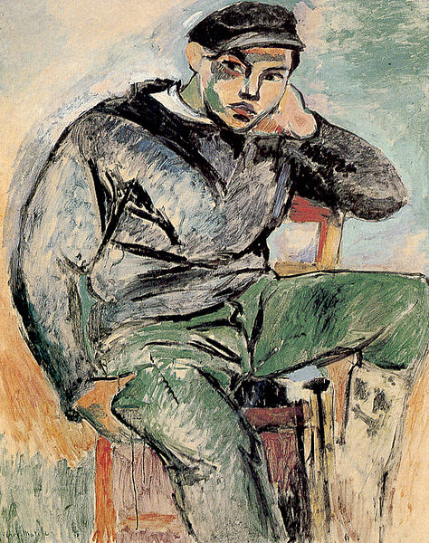
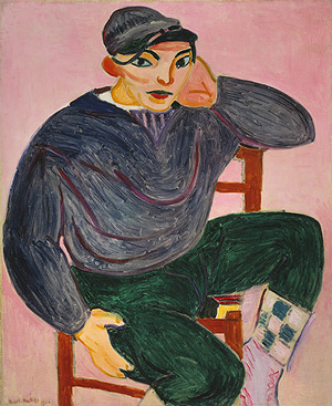
Sailor I, 1906 Henri Matisse
This piece has softer rounded lines with muted color.
The Sailor II Also in 1906 Henri Mattise
This work lacks a facial expression (mask like) and has sharp defined lines with theatrical colors.
CUBISM – and its relation to African Influence?
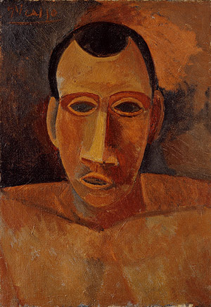
Pablo Picasso 20th Century artist lived (1881 – 1973)
It is interesting that many of Picasso’s exotic works were often exhibited in tandem with African works. They seem to have complemented one another very well. Like Mattise, Picasso also had an extensive collection of African objects.
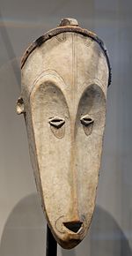
Below is a painting by Pablo and for further comparison I selected an African mask from the (Fang tribe)
Bust of Man 1908, by Pablo Picasso
Louvre Museum, Wooden Fang MaskPlace made: Gabon, Africa collection of André Lefèvre
I believe Pablo may have came across other types of African masks beside the Fang tribes. Note, the narrow thin nose of the Fang Tribes mask, yet the Bust of Man has a chiseled wider nose Pablo’s painting may very well have been merged from two styles of African tribal mask carvings.
Did you feel that some works were merged into one art form?
Do you feel the African culture received credit from European artists or were they marginalized?
What do you think about the impact traditional African and ceremonial pieces had on certain Early Modern art works?
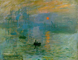
Impression, Sunrise (Impression,soleil levant) by Claude Monet 1872
Depicted in the harbor of Le Havre in France, this painting launched the Impressionist era. The word impression originally derived from the harsh review of a critic writing for the Le Charivari newspaper taken from Monet’s title work Impression, Sunrise the critic inadvertently coined the new term.
Below is an excerpt of Claude Monet’s explanation of how he came to name the above works and the critics response to this new style of painting.
“Landscape is nothing but an impression, and an instantaneous one, hence this label that was given us, by the way because of me. I had sent a thing done in Le Havre, from my window, sun in the mist and a few masts of boats sticking up in the foreground. … They asked me for a title for the catalogue, it couldn’t really be taken for a view of Le Havre, and I said: ‘Put Impression.’ [1]
It was first displayed in 1874[2] during the first independent art show of the Impressionists (who were not yet known by that name). Critic Louis Leroy, inspired by the painting’s name, titled his hostile review of the show in Le Charivari newspaper, “The Exhibition of the Impressionists”, thus inadvertently naming the new art movement. He wrote:
Impression—I was certain of it. I was just telling myself that, since I was impressed, there had to be some impression in it … and what freedom, what ease of workmanship! Wallpaper in its embryonic state is more finished than that seascape.” http://en.wikipedia.org/wiki/Impression,_Sunrise
When I read the critics words it truly made me cringe for Claude Monet who lived this pivoting moment in the Impressionist movement. I wonder what Monet was thinking, what was he feeling…when he first learned of this review. Regardless, it is Claude Monet’s name that is widely recognized from the Impressionist era and what was that critic guy’s name again?
Please note the following artists and their works.
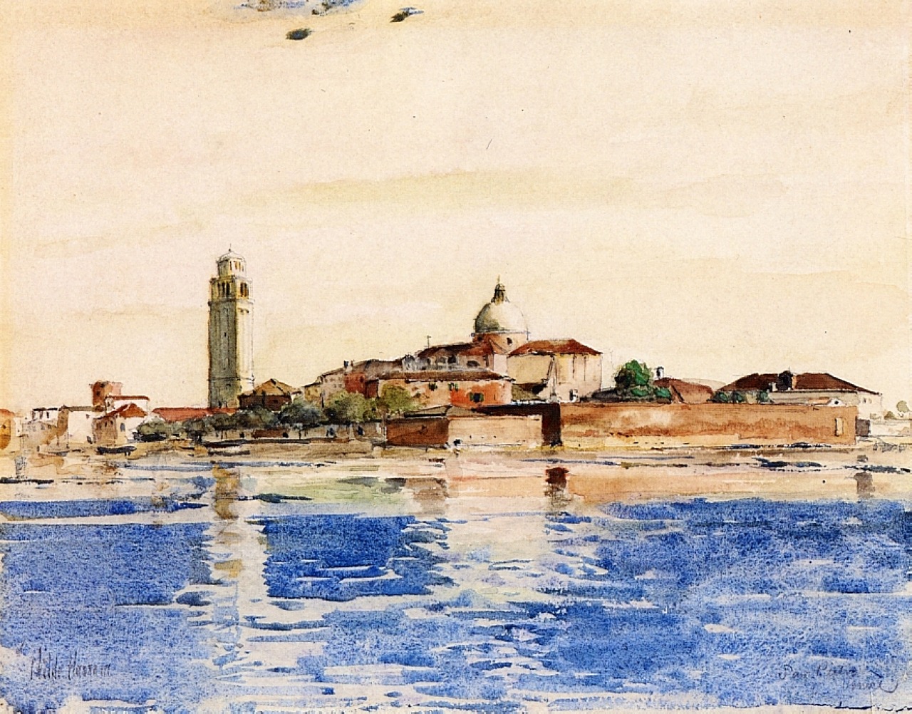
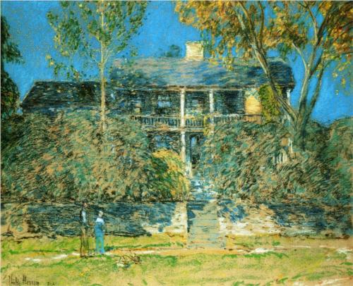
Impressionist artist Frederick Childe Hassam 1869-1935
San Pietro, Venice Completion Date: 1883Genre: Cityscape
I selected some of Frederick Childe Hassam works because his name was unknown to me, unlike Claude Monet’s or other well-known Impressionists and their works. Notice the San Pietro, Venice painting with its asymmetrical shapes of the tall buildings with the horizontal lines in the land, water and sky.
His shift towards Impressionist paint began through the 1890’s, he became known as an “extreme Impressionist” himself. He was also known for his “flag and window series” should you want to learn more about his art pieces be sure to access the link I provided below.
As art appreciation, concerning the Impressionists style I tend to have some negative feelings about the Impressionist subject matter. I can appreciate the prismatic colors, the landscapes, the broken brush strokes and use of impasto, the illumination of light and the use of creating shadows by using color instead of neutral, black or grays. For myself, I feel the Impressionist’s style is painted as an observer, watching a crowd, an activity or particular person(s) from a distance; feels distant, and a bit boring, captured in a fleeting and airy moment. Despite my personal opinion, I can still remember Claude Monet’s name…and what was that newspaper guy’s name?
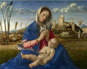
Below are two High Renaissance paintings for comparison. Painted in the pyramid composition style which focused on the main image depicted in the center and was often flanked on either side with parallel weighted forms.
From the top of Madonna’s head begins the point to form the pyramid and her left and right sides are slightly downward creating angled lines , the cropped bottom line is defined cross wards forming the complete pyramid.
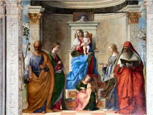
Another example of Giovanni Bellini works is shown below in the Renaissance pyramid format notice the similar weights that flank the image, unlike the Impressionist’s asymmetrical style.
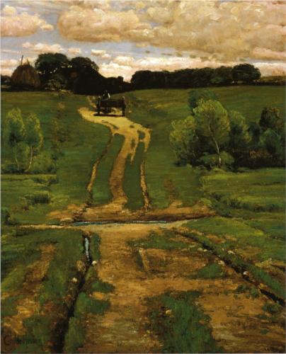
Impressionist painters commonly used casual everyday life events captured in a moment as if a photographer snapped a photo of the image. Not only were these painters known for asymmetrical designs they also used high horizontal lines and plunging perspectives as well.
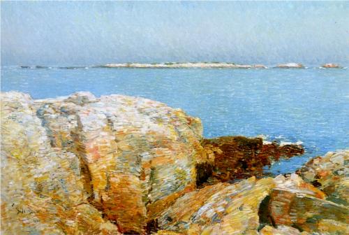
Below are two other examples of the Impressionist’s use of high horizontal line composition and plunging perspective.
Notice the high horizontal lines of the roofline, the plunging perspective of the courtyard and balanced asymmetrical trees on the opposites sides of the painting.
This last piece ties so many of the elements of an Impressionist painter’s style. For example in the distance there’s the tree line on top the hill,(high horizontal line) meeting in the middle is the (perspective plunge) in the dirt road and parallel within the painting is the (asymmetrical) trees and the ruts in the road.
Oh, by the way what was that newspaper critic’s name again? Claude Monet no that was the Impressionist ….
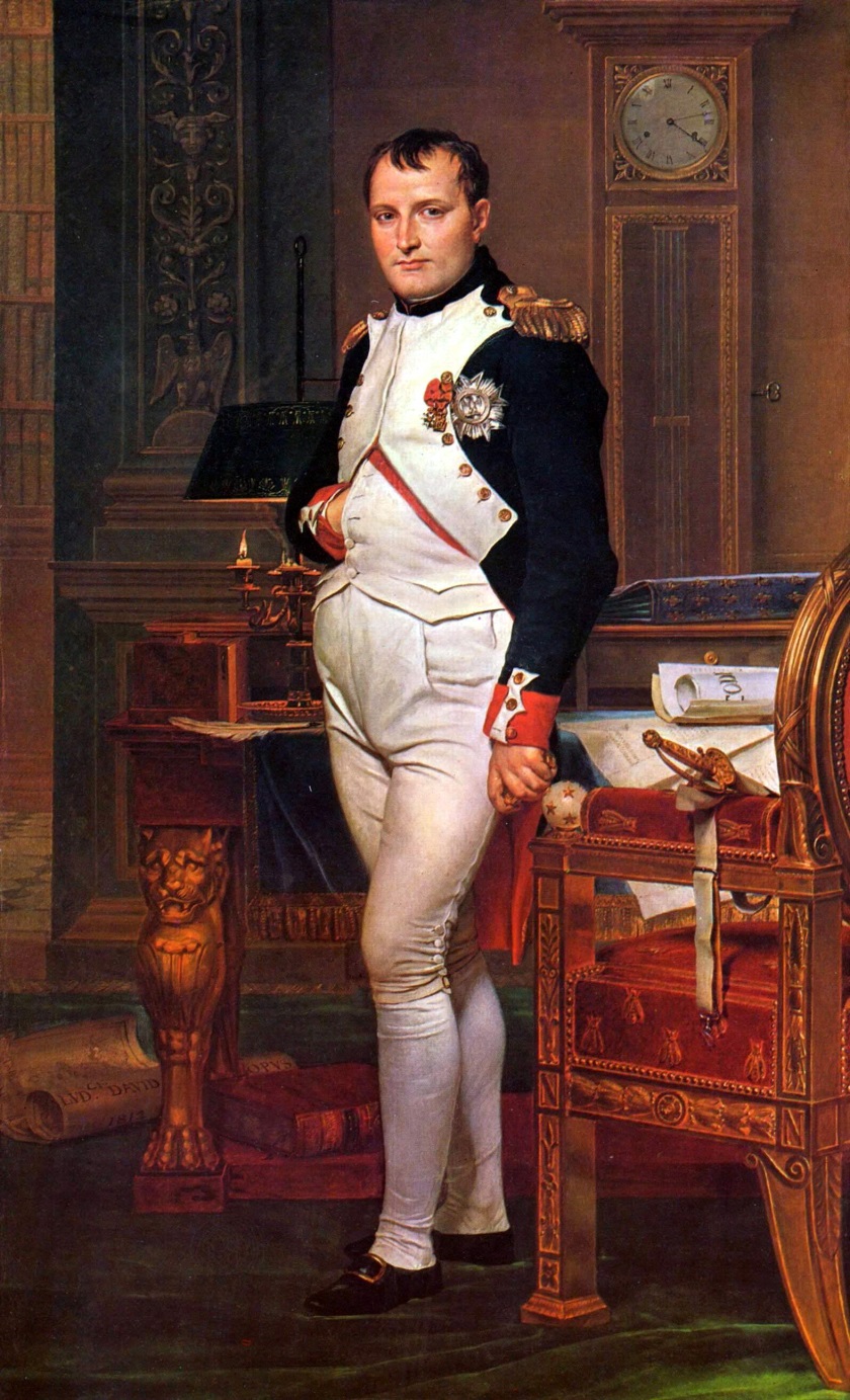
Jacques Louis David is recognized for his stark, linear paintings, many of his subjects were often portrayed as stern or serious (austere). His pieces were usually associated with moral messages or themes His art is usually connected with the French Revolution. The above art piece is a prime example of his style and period. Although, Napolean in His Study was after the French Revolution. A time period when Napolean was serving as a mility and civic leader, in a sense this is a piece of propaganda art. For example, present day campaigns or Presidents speeches circulate through the media, print and internet and sometimes in art (usually as a caricature ). Napolean’s publicity was in a form of art, such as this iconic image.
I chose this piece for all its subtle symbolism, notice the lion table decoration? this is often associated with great civilizations. Napolean’s military qualities of strength and leadership are shown wearing his uniform, his medal (legion of honor) is pinned on his uniform, the gold epaulettes on shown on his shoulders reminds one of his military status. The clock shows 4:13, it is not clear what time of the day it is (morning or evening) when he is shown here working in his study for the people of France. The scroll on his desk has the letters C O D with a hint of the letter E, this is the Napolenic Code, which became the legal standards in law for France, many of these laws are still followed in France. (Law Giver) Napolean is grasping a gold-colored object, it is not clear what it is, possibly an official seal? They is a gold-handled sword, quite possibly a prop to symbolize his military achievements and power. A scroll lies on the floor, look closely it has the artists name and date on it, could it be another type of advertisement for the artist? A book lays on the floor as if gently tossed, it is a copy of Plutarch’s Lives. This book is a list of who’s who, such as past powerful generals. The book is near Napolean’s feet, could it be a symbol that he is greater than the others before him? The fabric on the chair also resembles and upside down fleaur-de-lys, a type of lily that was associated with the French monarchy. Is this a message that France is no longer ruled by a monarch? The wrinkled carpet’s appearance is as if Napolean was interrupted and had scooted his chair away from the desk to stand. Was the message that he was tirelessly working into the late evening or early morning for the people of France. Lastly, his hair is a bit tousled as if he had been heavily in thought and planning, quite possibly for France’s future?
Art and architecture during the 18th century was noticeably defined in the classical era. Music during this period was not as clearly defined. As the growing audience began to transform from aristocratic patrons (Baroque/Rococo) to middle class listeners music transitioned from a Polyphonic style to the Homo-phonic texture. This music was less complex than the Baroque’s “gallant style.” Composers grew independent from the aristocratic hold and began to share their music on the public platform, thus changing the overall sound to meet the new audiences listening style.
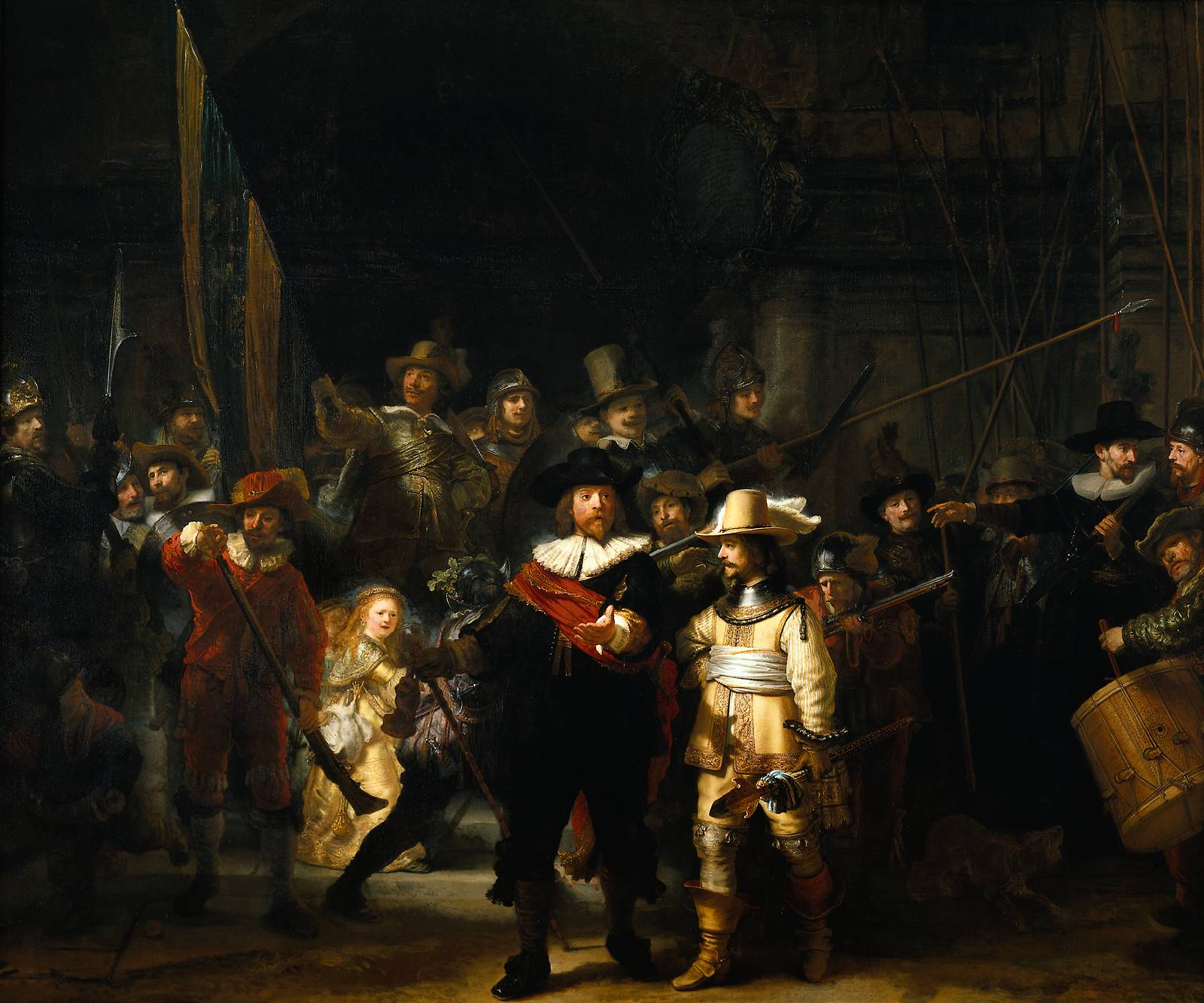
The Night Watch is colossal. In its original dimensions it measured approximately 13 by 16 feet and contained not only the 18 guardsmen but 16 other figures added by Rembrandt to give still more animation to an already tumultuous scene. It was by far the most revolutionary painting Rembrandt had yet made, transforming the traditional Dutch group portrait into a dazzling blaze of light, color and motion, and subordinating the requirements of orthodox portraiture to a far larger, more complex but still unified whole. In Rembrandt’s hands what was, after all, a commonplace affair became filled with Baroque pictorial splendor, loud with the sound of drum and musket, the thud of ramrods, the barking of a dog, the cries of children. In the forefront Captain Banning Cocq – in black, with a red sash – and his lieutenant in yellow lead the forward drive of the still unformed ranks. The sense of movement is reinforced by converging diagonal lines: on the right, the foreshortened spontoon in the lieutenant’s hand, the musket above it and the lance still higher; and on the left, the captain’s staff, its line repeated above by another musket and the banner. The effect on the viewer is direct; he feels that he had best get out of the way.
I chose this painting for its unusual size 13by 16 feet, I can only imagine how grand it is to stand before this mass painting. It has three main characteristics, its massive size, the use of light and shadow (chiaroscuro) and it shows motion. Amongst the crowd one’s eye is drawn to three people. the first two gentleman are in the center, note there is a small girl wearing the yellow dress near the center left in the background. In reading, about this famous painting I learned that the color yellow meant victory. A total of 34 figures are in the painting. The painting seems to have a celebratory atmosphere, I was drawn to the rich red colors and the use of the light and dark shadows that create a sense of movement. Notice the direction of the shadow on the Captain’s hand crossing over to the lieutenant and then the shadow of the Captains foot is at a different angle.
One of the most revolutionary occurrences during the 16th century was the Protestant Reformation. The Ninety-Five Theses writings of Martin Luther King related to the over indulgence of the Church and he put in question the entire theology and structure of the Church.
These writings came at a time when the Papacy’s increasing wealth, the negligence of the clergy, corruption and indulgence was rampant within the Church. The Papal lived in luxury while many others lived in squalor. The people began to question the Church’s spiritual leading and the growing wealth.
Imagine the inner turmoil of the many people living in this time period those who weighed their own religious beliefs between salvation and their fate
The people began to seek answers for a new spiritual link to a religion that would connect them on a deeper personal level. Hence, the Protestant Reformation, Martin Luther and John Calvin both represented the start and second wave of the Protestant Reformation.
Art before the Reformation period reflected religious subjects and some came with ominous messages.
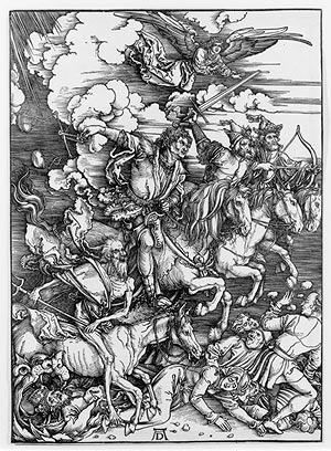
For example, artist Albrecht Durer’s Four Horsemen of the Apocalypse, 1497-98, woodcut. Death, War, Pestilence, and Famine are riding above the secular groups.
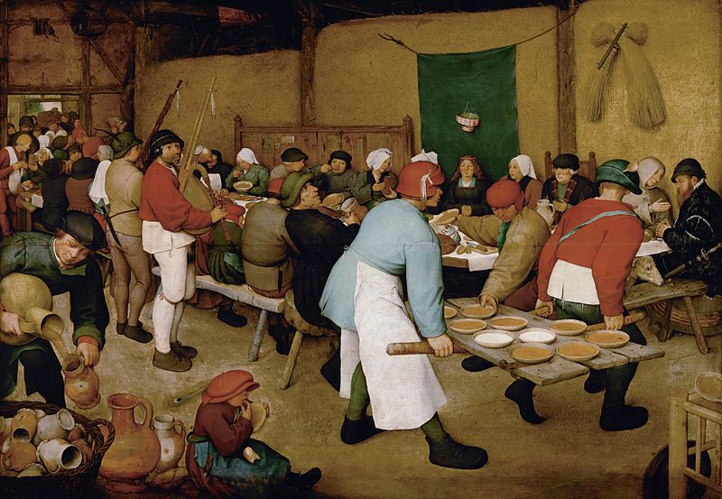
During and after the Protestant Reformation art shifted towards, history painting, landscape, portrait and still life painting. Flemish painter’s Pieter Bruegel’s The Peasant Wedding, gives insight of a Flemish Peasant’s wedding. There is no reference of a religious theme or symbolism in this painting. Unlike, Jan Van Eyck’s painting “The Arnolfini Portrait.
Jan Van Eyck (Flemish)
Jan van Eyck was important not only to the northern Renaissance, but to the entire Renaissance. He is credited with the invention of the oil-glazing technique, which replaced the earlier egg-tempera method. In the early years of the Renaissance, the artist generally began with a monochromatic drawing using egg tempera on a wood panel, and then layers of oil-glazes were painted on top of it. This allowed for rich details and luminous colors (later artists would work directly in oils on canvas, allowing the paintings to become larger and lighter, without warping or insect infestation). Whether or not Van Eyck was actually the first person to use this new medium may be of secondary importance to the achievements of his work, for he was truly a master of meticulous detail and well-planned compositions.
Jan van Eyck, Arnolfini Wedding, 1434
Arnolfini Wedding (wall detail)
The Marriage of Giovanni Arnolfini, commonly called the Arnolfini Wedding, is van Eyck’s most famous work. The subject is obvious, given the pose of the couple. It may, however, be confusing to the modern viewer that he chose to portray them in their bed chamber, instead of in a church. Here, it is necessary to keep in mind that everything portrayed in this picture has symbolic meaning. The fact that the woman appears to be pregnant is symbolic of the holy purpose of their matrimony of bringing children into the world. This also explains the choice of the color of her dress (green representing fertility), and the fact that she is pulling her dress up in the front (signifying that she is willing to bear children). Other specifically symbolic imagery includes the dog who stands between them (fidelity to each other; loyalty to God), the sandals which have been removed (signifying that they are standing on holy ground), and the single candle in the candelabra (the presence of Christ in their union). A detail of the back wall reveals a convex mirror which reflects their backs and two other persons (probably the priest and the artist). A signature above which says “Jan van Eyck was here” testifies to the artist’s presence during the ceremony, and it is possible that the purpose of the painting is partly a matter of documenting the legality of their matrimony. Sources: http://robinurton.com/history/Renaissance/northrenaiss.htm
 H. 19 in. (48.3 cm)Gift of Robert E. Tod, 1937 (37.191.1) On view: Gallery 204
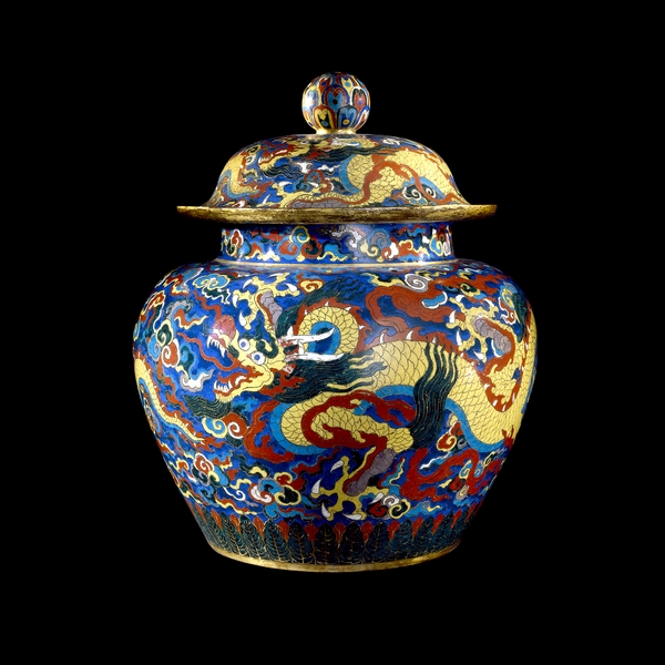 Ok, start counting… this little Dragon went to the market; this little Dragon stayed home; don’t stop counting I know you know this rhyme… 🙂


